Color Psychology for Selling Homes: Choose Paint Tones That Attract Buyers
Real Estate October 9, 2025
Real Estate October 9, 2025
Intro text
Color Psychology: Choosing Paint Tones That Sell Homes
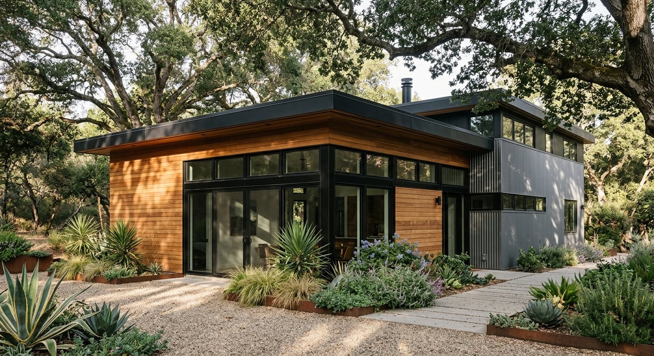
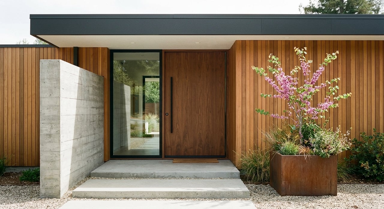
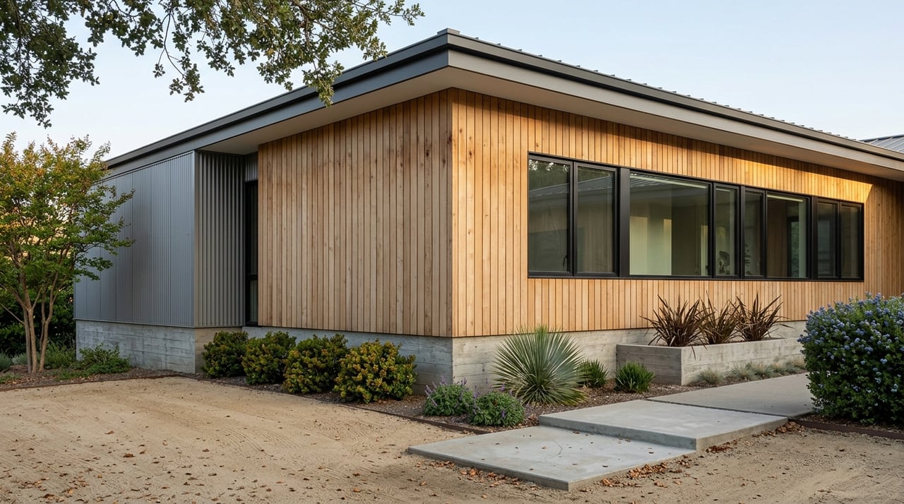
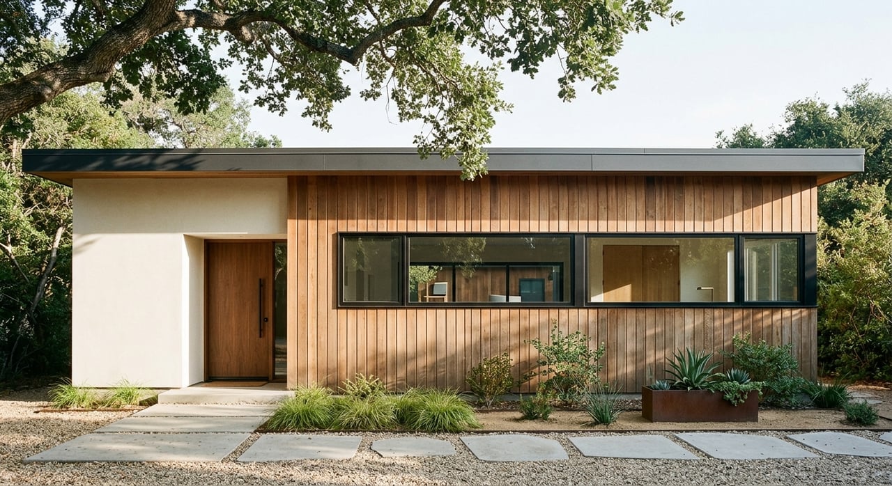
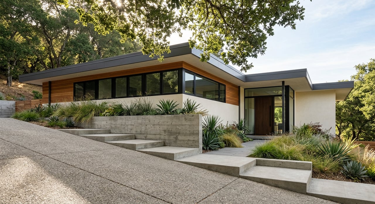
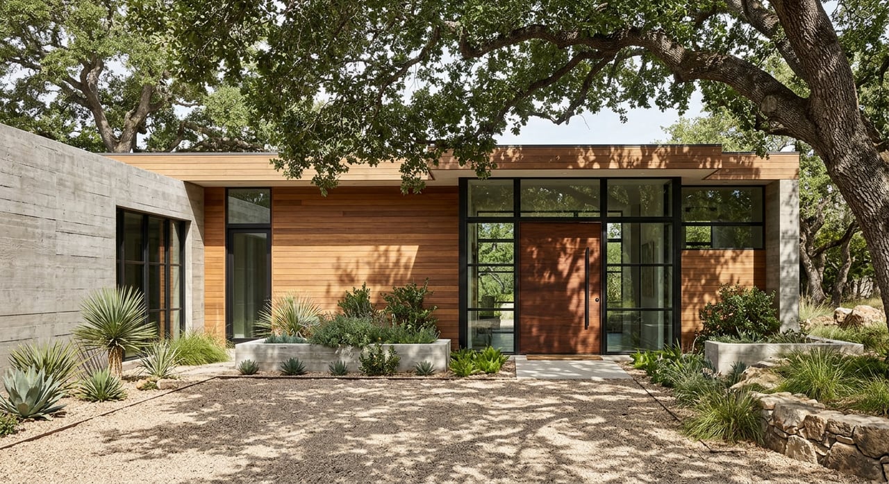
First impressions start at the front door and carry through each room. Light neutral walls create a clean backdrop that helps potential buyers picture their possessions in the space. Entryways painted in a subtle tone feel welcoming and signal careful maintenance. For curb appeal, a balanced exterior shade pairs well with the roof and trim to highlight architectural features. Real estate agents often recommend confronting visual clutter with a unified palette so that spaces look organized and maintained.
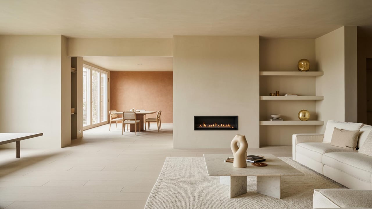
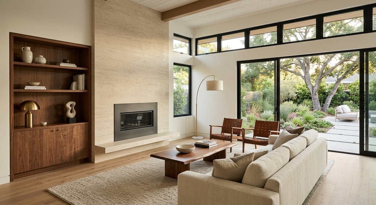
Neutral paint tones make spaces feel open and adaptable. A soft off-white or warm beige brightens interiors under natural light and complements many styles of furniture. Neutral walls reduce visual noise and help focal pieces stand out during showings. When preparing a home for listing, choose a single neutral on main living areas to create flow. Small accent touches in closets and half baths can use richer tones without overwhelming buyers.
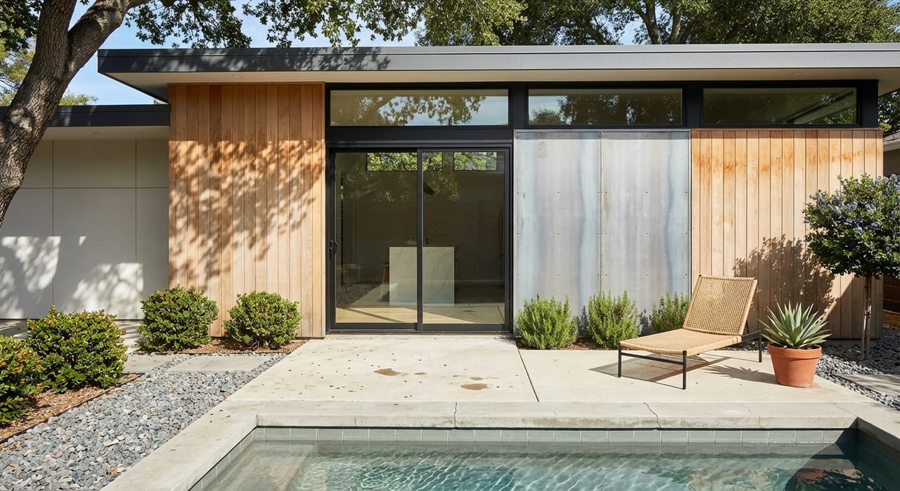
Warm paint tones add a sense of comfort that encourages lingering. Subtle tans or muted terracotta work well in living rooms and dining areas where a sense of hospitality matters. Match warm wall colors with medium wood finishes to emphasize a cohesive scheme. When staging, incorporate textured fabrics and layered lighting to accentuate the warmth and create a lived-in, appealing mood.
Cool paint tones promote a calm atmosphere in bedrooms and study spaces. Pale blues and soft greens can make sleeping areas feel restful and orderly. Cool colors pair with light upholstery and minimal window treatments to allow light to reflect and expand the visual space. For home offices, a restrained cool shade supports concentration while keeping the room inviting for buyers who value functionality.
Accent colors direct the eye to desirable features such as fireplaces, built-ins, or architectural trim. A bold accent wall in a formal dining room or a deep shade in a powder room creates memorable character without dominating the entire home. Use accent hues sparingly and coordinate with neutral surroundings for balance. In kitchens, a subtle contrasting color on an island or pantry door can suggest thoughtful design choices to prospective purchasers.
Light changes how paint tones read throughout the day. North-facing rooms tend to receive softer, cooler illumination and benefit from warmer wall shades to avoid a dim feeling. South-facing spaces get strong daylight and can support paler, airier tones. Inspect paint samples on multiple walls and observe them during morning and late-afternoon light to confirm the intended effect before finalizing choices.
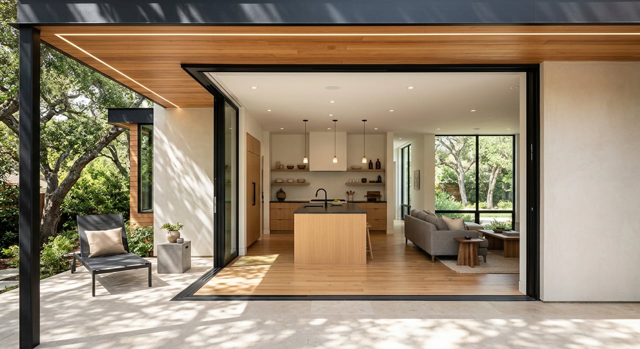
Paint should complement flooring and fixtures rather than compete with them. Hardwood floors with warm undertones pair well with neutrals that emphasize grain and texture. Cool stone or tile surfaces harmonize with soft cool walls to create a seamless look. For fixtures, brushed metals suit muted wall tones while polished finishes often read best against subdued backgrounds. Coordinate samples in situ to ensure cohesion.
Finish impacts appearance and maintenance. Eggshell and satin finishes offer subtle sheen and wipeability in living areas and hallways. Semi-gloss works well for trim, doors, and cabinetry because it highlights details and resists scuffing. Flat finishes help disguise imperfections on ceilings and less-trafficked walls. Choose finishes that balance aesthetic goals with the practical needs of show-ready presentation.
Preparation improves final results and perceived value. Patch small holes and sand rough spots to create a smooth surface for paint. A fresh coat over repaired drywall enhances light reflection and restores a sense of care. When covering strong existing colors, apply a primer to ensure true tones and reduce the number of coats needed. Clean walls before painting so finishes adhere evenly and present consistently during showings.
Coordinated color schemes support photographed listing images and in-person walkthroughs. Use textiles and decor to reinforce wall tones—throw pillows, rugs, and art that echo the palette create a cohesive experience. Keep patterns minimal in key rooms so furnishings complement the architecture. Strategic placement of small plants or metallic accents brings life without detracting from the painted surfaces.
Choosing the right paint tones can make a measurable difference in buyer perception and time on market. Local expertise matters—work with Alexis Thompson RE to select colors that appeal to buyers in your local market and enhance your home's strengths. Ready to see how strategic color choices can boost your sale? Contact Alexis Thompson RE today to get a tailored color plan and a competitive edge.
Stay up to date on the latest real estate trends.
Etiam non quam lacus suspendisse faucibus interdum. Orci ac auctor augue mauris augue neque. Bibendum at varius vel pharetra. Viverra orci sagittis eu volutpat.